A 1930s apartment and gallery, packed with erotic touches and eccentric clashes, doesn’t fail to titillate
Fasten your seatbelts. Maria Vittoria Paggini wants to challenge your perceptions, taking you on a riveting journey through Casa Ornella, her part home, part-gallery in Milan. For the second year in a row, the exuberant interior designer has given her apartment a complete makeover, unveiling it during Milan Design Week. Her home is in a 1930s residential building in the canal area of Navigli. And her theme? Porno chic.
“Despite the proliferation of nude figures, as you can see, the house doesn’t want to be pornographic. By normalising these images I almost want them to disappear, inviting viewers to move beyond exposed bodies,” says Paggini.
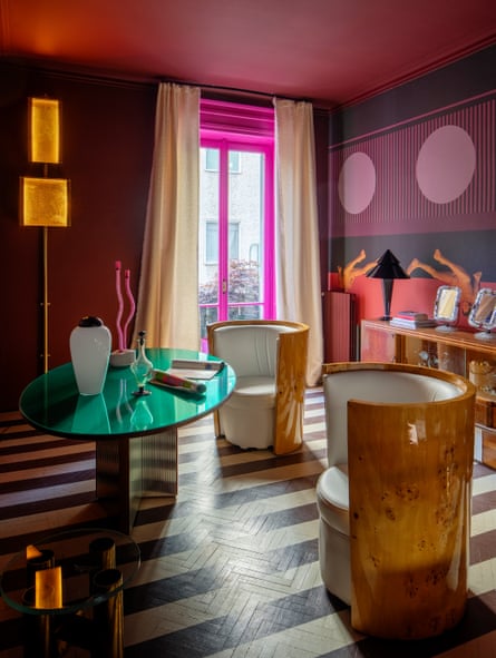
The show begins in the living room under a circus-inspired ceiling that draws the eye upwards. The space is animated by curtains covered in childlike illustrations, handpainted by the artist and designer Michele Chiocciolini. He stayed in the apartment for a week and while he was there drew on bedsheets that Paggini later transformed into drapes by adding trimmings and velvet. Also in the room are a sculptural light installation, rounded minimalist sofas and parquet floors painted in black and white. What’s her guiding principle? “I go with my gut feeling. And the more distant I feel from a given object in terms of aesthetic, the more I want to use it. I love exaggerating contrasts, taking them to an extreme. Everything is a challenge.”
With no clear signal of period or place, this home is meant to disorient and feel strange. “While often designers tend to be bound by rules, matching elements to create fluid spaces, by choice I go in the opposite direction. I see it as freedom to dip into my imagination to fully expose my character and soul.” To create the right ambience, a 1970s disco classic, A far l’amore comincia tu (Do it, do it again in English) by Raffaella Carrà, is playing and there’s a bottle of bubbly ready to be opened.
The foot-shaped rug draped over the sofa and on to the floor, “as if it were usable art”, is by Tatiana Brodatch. “She was already part of the project, because the wallpaper I created for the study uses the images of her nude plasticine bodies, reworked into a graphic setting. In one of our meetings, I saw her drawing of the foot and was immediately attracted to it, because I’ve always had this awkward reticence about showing my feet. I guess it’s my own way of getting over it!”
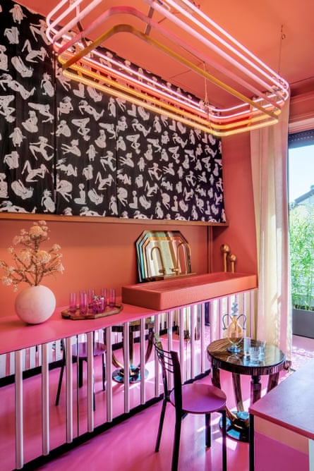
At the centre of the apartment, the dining room with its flowery, 70s-style chairs is flanked by the entrance, the dressing room, the kitchen and the bathroom, all behind custom-made doors in mirror, fluted glass and chequered wood. The long, narrow kitchen continues the disco theme with a neon LED lamp accentuating the predominantly pink hues. Pierre Frey fabric adorns sliding panels that conceal shelves. An Egyptian pharaoh lamp from a flea market sits next to a double induction hob. Push-open cabinets in slated wood and mirror encase everything else a kitchen needs. The photograph of Barbie, among others in the home, is by Alberto Alicata ,who collaborated with Mattel to recreate iconic fashion shoots.
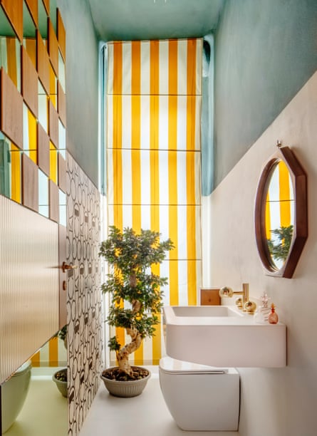
“In this house, every time you turn around you notice a different detail,” she says, “particularly through the reflections from small and large mirrors or through actual holes in the walls.” A first glimpse of the bathroom, with its yellow-and-white striped curtains beneath a turquoise ceiling, may evoke images of Amalfi’s fresh summery vibe.
Owing to the number of elements, it’s easy to think Paggini randomly assembles unrelated items. “I work a lot on instinct, but my choices are reasoned following a balance of my own. I know exactly where to raise or lower the volume.”

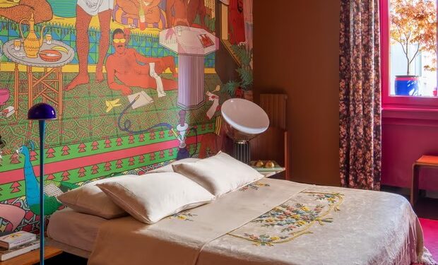
Probably the strongest clash and yet the most beautiful scene is viewed when peeping into Paggini’s bedroom from the circular hole in the study wall. Her grandmother’s embroidered bedspread and floral curtains are offset by a stunning mural by illustrator Damiano Groppi. Perhaps there is no clash and erotic figures, homosexual images and grandmothers’ embroidery are natural bedfellows after all.
During design week, more than 10,000 people lined up to get a taste of Paggini’s eccentric aesthetic. “I’m very happy that this year’s theme had such a positive response. It could have gone wrong in so many ways: be labelled as trashy or excessively hardcore. Instead, it appealed to people of all ages and, more importantly, they understood the underlying playfulness I wanted to convey.”
Source: The Guardian


Recent Comments